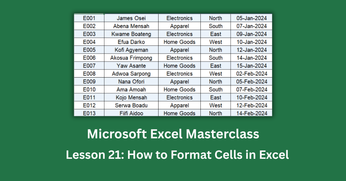
Cell formatting in Excel is one of those skills that separates a spreadsheet that gets ignored from one that actually gets used. Whether you’re tracking employee sales data, building a financial summary, or just trying to make sense of a messy dataset, knowing how to format cells in Excel can transform raw numbers into something people genuinely want to read.
The features covered here are available in Excel 2016 and all later versions, including Excel 2019, Excel 2021, Microsoft 365, and Excel for the web. A few advanced conditional formatting options (like icon sets with custom rules) require Excel 2019 or Microsoft 365, and those exceptions are noted where relevant.
Take the sales dataset used throughout this guide: 30 rows of employee performance records spanning five months, three departments, and four regions. When it’s just numbers on a white background, nobody knows where to look first. Once you apply font styling, status-based color fills, borders, and proper alignment, the same data tells a clear story at a glance.
Quick Takeaways:
- Bold, dark-filled headers immediately signal where a table begins and what each column means.
- Color-coded cells (green, yellow, red) let readers spot performance problems without reading every row.
- Alternating row shading reduces eye strain and helps readers track data across wide tables.
- Number and date formats control how values display without changing the underlying data.
- Consistent alignment (centered headers, left-aligned labels, right-aligned numbers) creates a visual rhythm that feels professional.
Why Formatting Is More Than Just “Making It Pretty”
A lot of people treat formatting as the last five minutes of a project. I’d argue it deserves more respect than that.
When Microsoft studied how users interact with spreadsheets, readability consistently emerged as a barrier to decision-making. A well-formatted table reduces the cognitive load on whoever reads it. Less time scanning, more time acting.
In the sales dataset, the “Status” column holds three values: Exceeded Target, Met Target, and Below Target. Without formatting, a manager has to read every single cell to spot problems. With green, yellow, and red fills applied to those cells, the pattern is obvious in under two seconds. That’s the practical value of formatting.
How to Format Fonts in Excel
Change Font Style and Size
Select your target cells, then head to Home > Font. From there you can change the typeface, size, bold, italic, or underline. For headers, bold text at 11–12pt in a clean sans-serif like Arial or Calibri works well in most contexts.
In our dataset, the header row uses bold white text (RGB: 255, 255, 255) on a navy blue fill (hex #1F3864). That contrast ratio easily passes accessibility readability standards, which matters if your spreadsheets are shared broadly.
Apply Font Color
Click the arrow beside the Font Color button (the “A” with a color bar) in the Font group. For the status-color column, the red text used for “Below Target” rows is RGB (156, 0, 6), not a flat red. That darker shade is easier on the eyes and still communicates urgency clearly.
Pro tip: avoid using color as the only indicator of meaning. Pair it with a text label or icon so colorblind users aren’t excluded.
How to Use Cell Fill Colors and Conditional Formatting
Manual Fill Colors
The Fill Color bucket (paint can icon) in the Font group lets you apply a solid background to any cell. For alternating row shading, the quickest method is to select every other row manually, apply a light fill, then repeat. For larger datasets, use a table or conditional formatting instead.
The sales data uses a light blue fill (hex #EBF3FB) for even-numbered rows and white for odd ones. This banding makes it far easier to trace a row across all 15 columns without losing your place.
Conditional Formatting for Status Cells
Conditional formatting applies color automatically based on cell values. It’s one of the most powerful tools in Excel’s formatting toolkit.
To replicate the status color logic in the dataset:
- Select the Status column cells (e.g., L2:L31).
- Go to Home > Conditional Formatting > Highlight Cells Rules > Text that Contains.
- Type “Exceeded Target” and set a green fill.
- Repeat for “Met Target” (yellow) and “Below Target” (red).
This approach means the formatting updates automatically if a value changes from Met Target to Exceeded Target. The spreadsheet does the thinking for you.
For more on conditional formatting rules, Microsoft’s official conditional formatting guide walks through every rule type available.
How to Add Borders to Cells
All Borders vs. Outer Border
Borders live under Home > Font > Borders (the square icon with a dropdown arrow). “All Borders” draws lines around every cell in your selection. “Thick Box Border” draws a heavier outline around the whole selection, which is useful for separating sections.
The dataset applies a thin black border to every data cell. Combined with the alternating row shading, this creates a clean grid that’s easy to read without feeling cluttered.
Format Cells Dialog for Custom Borders
For finer control, press Ctrl + 1 to open the Format Cells dialog. Go to the Border tab and set line style, color, and position individually. This is useful when you want a thick bottom border under a totals row, for example.
How to Control Cell Alignment
Horizontal and Vertical Alignment
The Alignment group (Home tab) has six main options: left, center, right, top, middle, and bottom. The general rule that works well in most spreadsheets: center column headers, left-align text labels, and right-align or center numerical values.
In the Summary Analysis sheet of the dataset, the department names in column A are left-aligned while revenue totals in columns B through E are center-aligned. It creates a visual rhythm that makes the table faster to scan.
Wrap Text and Merge & Center
Wrap Text lets long content fold within the cell instead of spilling into the next column. It’s particularly useful for notes columns or any header that’s longer than the column width.
Merge & Center combines multiple cells into one, ideal for report titles. The dataset’s Summary sheet uses a merged cell across A1:F1 for the “SALES PERFORMANCE SUMMARY” heading. Use this sparingly though. Merged cells can cause problems with sorting and copy-paste, so avoid merging cells inside a data table.
Number and Date Formatting
Currency, Percentages, and Dates
These formats control how values display without changing the actual stored value. In the dataset:
- Revenue and commission columns use $#,##0.00 for clean currency display.
- The “% of Target” column uses 0.0%, which converts the decimal formula result into a readable percentage.
- The Sales Date column uses DD-MMM-YYYY (e.g., 05-Jan-2024), making it easier to spot seasonal patterns across rows.
To apply these, select the relevant cells and press Ctrl + 1, then go to the Number tab. You’ll find pre-built formats for currency, percentage, date, and more, plus a custom field if you need something specific.
For a deeper look at number format codes, Exceljet’s number format guide is one of the most practical references available.
Applying Formatting Consistently Across Large Datasets
Use Format Painter
Found in Home > Clipboard, the Format Painter copies all formatting from one cell (font, fill, borders, alignment, number format) and pastes it onto another. Click once to paint a single selection. Double-click to keep it active across multiple selections.
This is the fastest way to bring a new row or column into line with the rest of a table.
Use Excel Tables for Automatic Formatting
Pressing Ctrl + T converts a data range into an Excel Table. Tables apply banding, bold headers, and filter arrows automatically. They also expand formatting to include new rows as data is added, which is a real time-saver in live datasets.
Putting It All Together
The sales dataset started as 30 rows of plain numbers. After applying the techniques above: a navy header row with bold white text, color-coded status cells, alternating row fills, consistent borders, and proper number formats, it became a report that communicates performance at a glance.
Start with your headers. Make them stand out with a bold font and a distinct fill color. Then work through alignment, borders, and number formatting for the data rows. Finish with conditional formatting on any column that carries status or priority information.
Formatting doesn’t take as long as most people expect, especially once you understand which tools to reach for. And the payoff, a spreadsheet that anyone on your team can read without a guided tour, is absolutely worth the extra few minutes.